
New Cover!
/
Original cover
In the midst of all the upcoming Book 2 madness, I have a bit of news about Book 1. Most book series have similar covers or a similar look to the covers across the series. When I started thinking about what I wanted for the Cauldron cover, I took a long look at the cover for The River Maiden. And I decided that I wanted to take the look of the series in a different direction.
Let me be clear, I do like the original cover for The River Maiden. I've gotten a lot of positive feedback on it. However, there are just two things I would change.
1) It's not great in black and white or thumbnail size. And in the age of ebooks and e-ink. Black and white and/or thumbnail size, is how a lot of people first see it. I thought I needed a cover that is eye-catching in both.
2) It wasn't my original vision. It is what told the graphic designer, who was very accommodating and great to work with, I wanted. The photo of the jars and jugs evokes the rustic Appalachian life that Sarah grew up with. But I'm just not sure it's evocative of the main theme of the story.
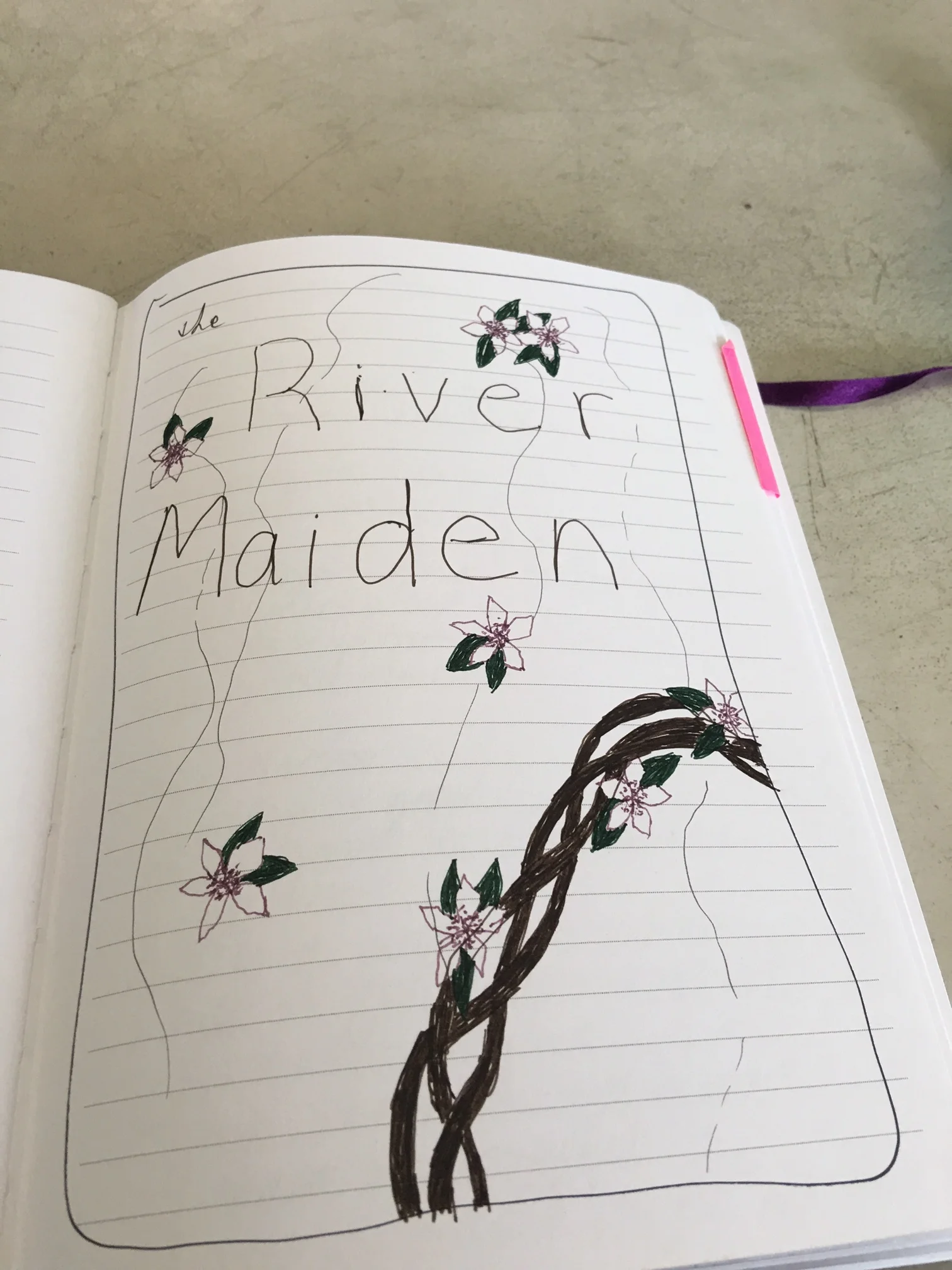
Even before I decided to publish the book myself, I had a vague idea of what I wanted, and it centered around the crown of flowers that Sarah makes for her mother on that fateful morning in 1976. In fact three years ago at the James River Writer's Conference while listening to the king of cover designers, Chip Kidd, talk about some of his greatest hits, I sketched out a quick design. It was the crown floating with a few blooms floating away from it.
But in the course of editing and formatting, and paying for one designer to botch and refuse to fix a design, and having to search for another, I eventually chose expediency and went with a photo that I had taken of jars stored on an old worn table in the back of my own Granny's carriage house (No, my Granny is not a moonshiner. She just likes old jars.)
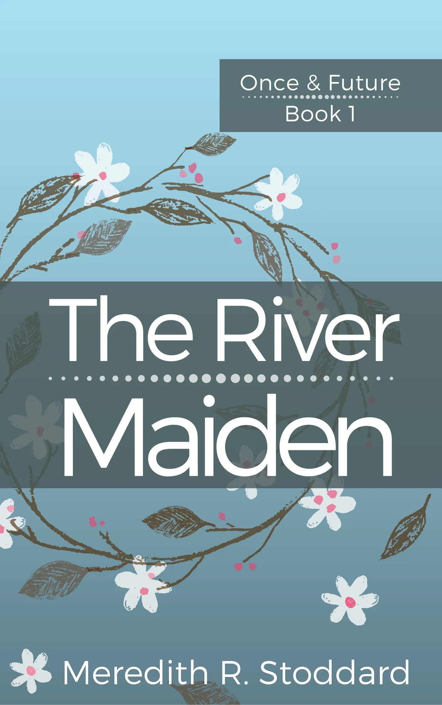
It has served me well, but I'm very excited to have the new cover. This one is far more similar to the cover I originally envisioned. It has the flowered crown with a few blooms falling away. They're floating on a blue background calling on the image of water, and of course the UNC setting for the book.
It also helped me establish the look that I want to have for the rest of the series. You might also notice that the short stories Unfit and Buddy also have new covers the same style. Hopefully in the next week or so, I can show the cover of Cauldron.
